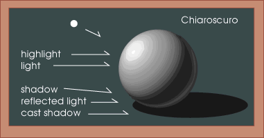
Contrast
|
What is chiaroscuro
Chiaroscuro is an Italian artistic term for used to describe the dramatic effect of contrasting areas of light and dark in an artwork, particularly paintings. It comes from the combination of the Italian words for "light" and "dark." |
|
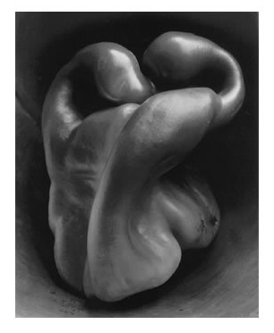
Edward Weston
|
This is one of Edward Weston's image, at first i thought this was 2 tongues but i looked at it closely, then i see this as 2 old peppers. I think this image is really interesting because it makes the audience ask a lot questions. This image is also composed really well. The light and dark effect makes the image have a lot contrast. The light is harsh light because its only focusing on the 2 peppers as you can see the background is dark.
|
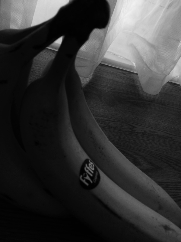
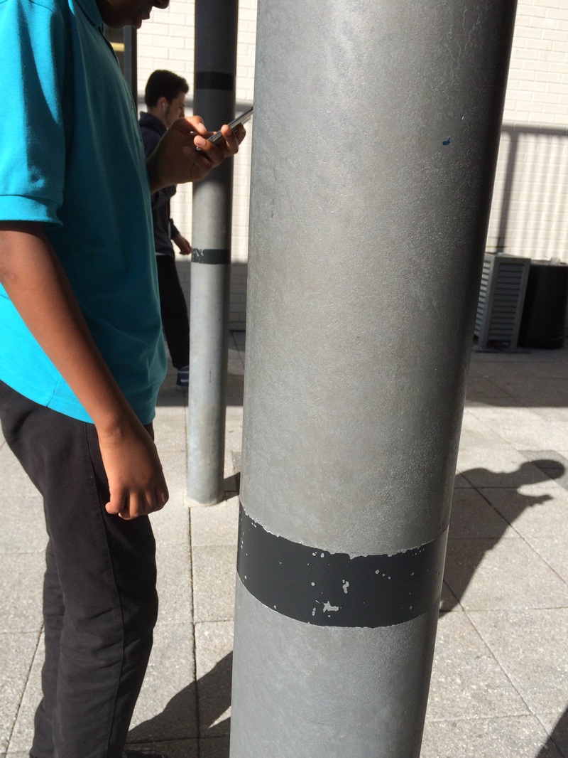
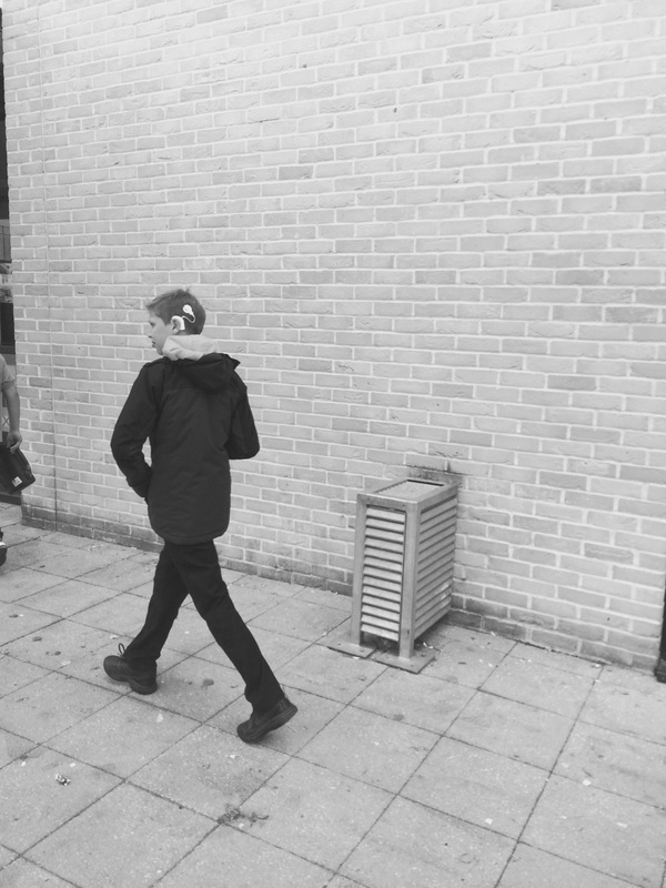
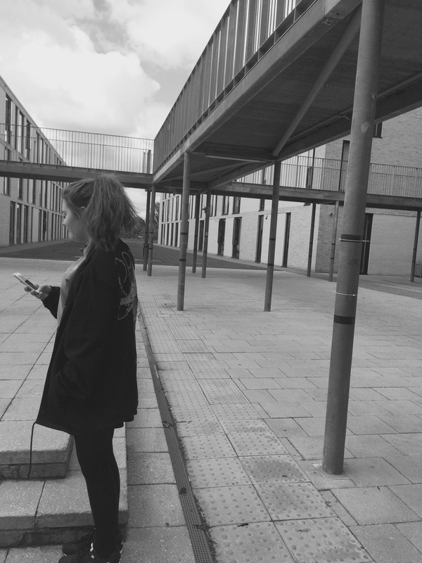
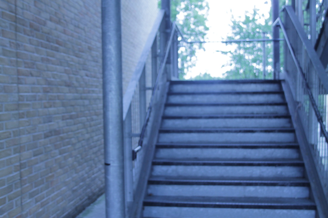
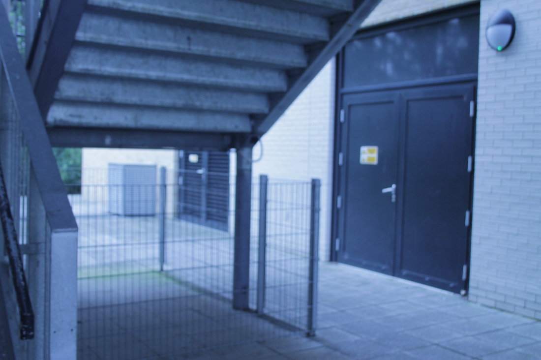
Photo shoot no.1
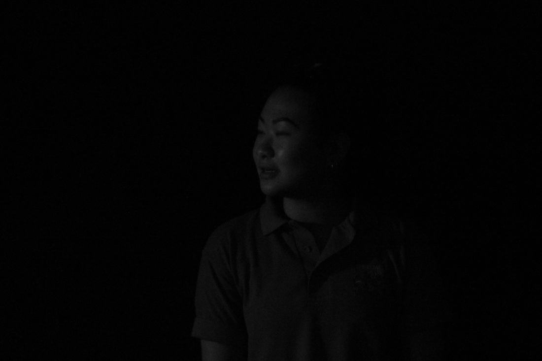
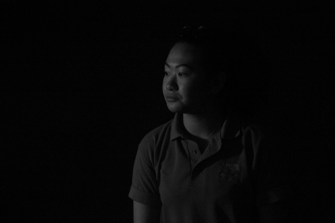
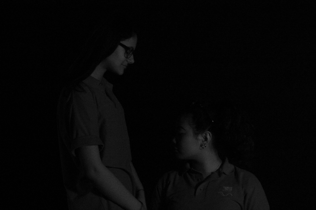
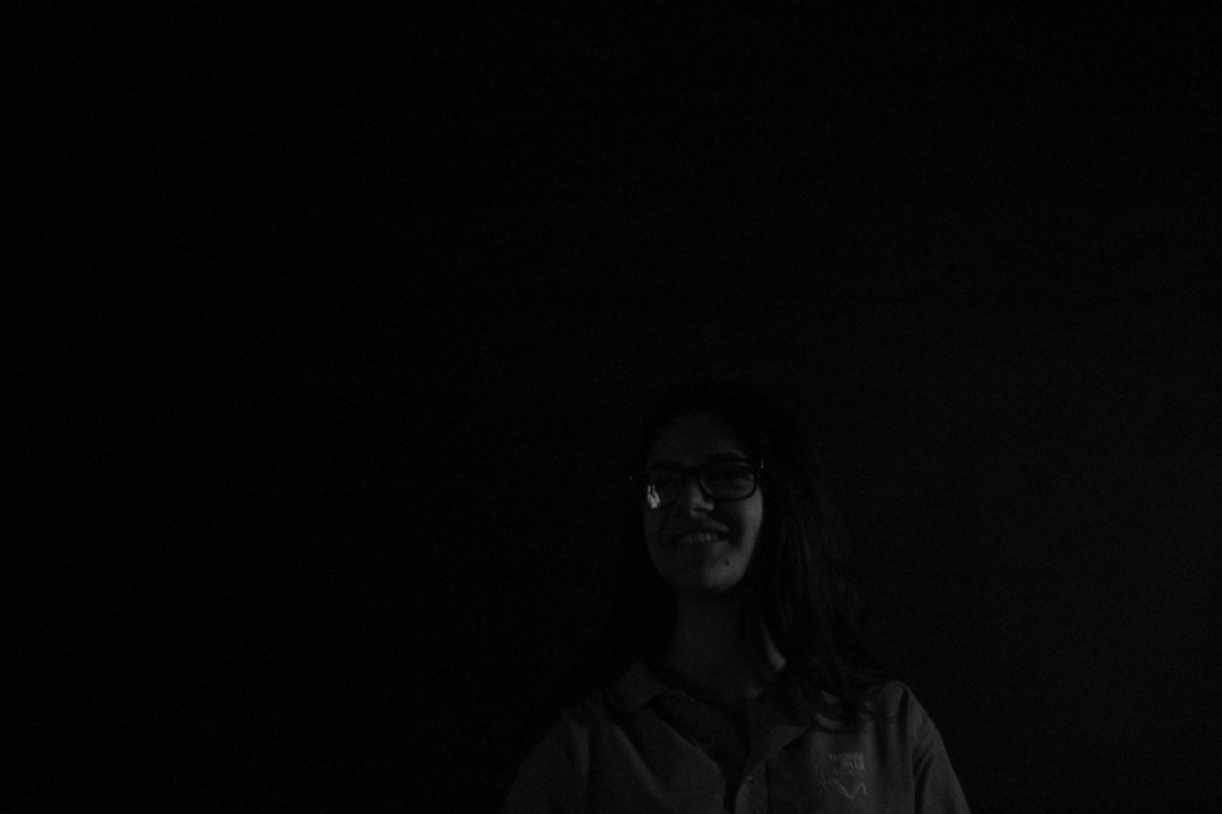
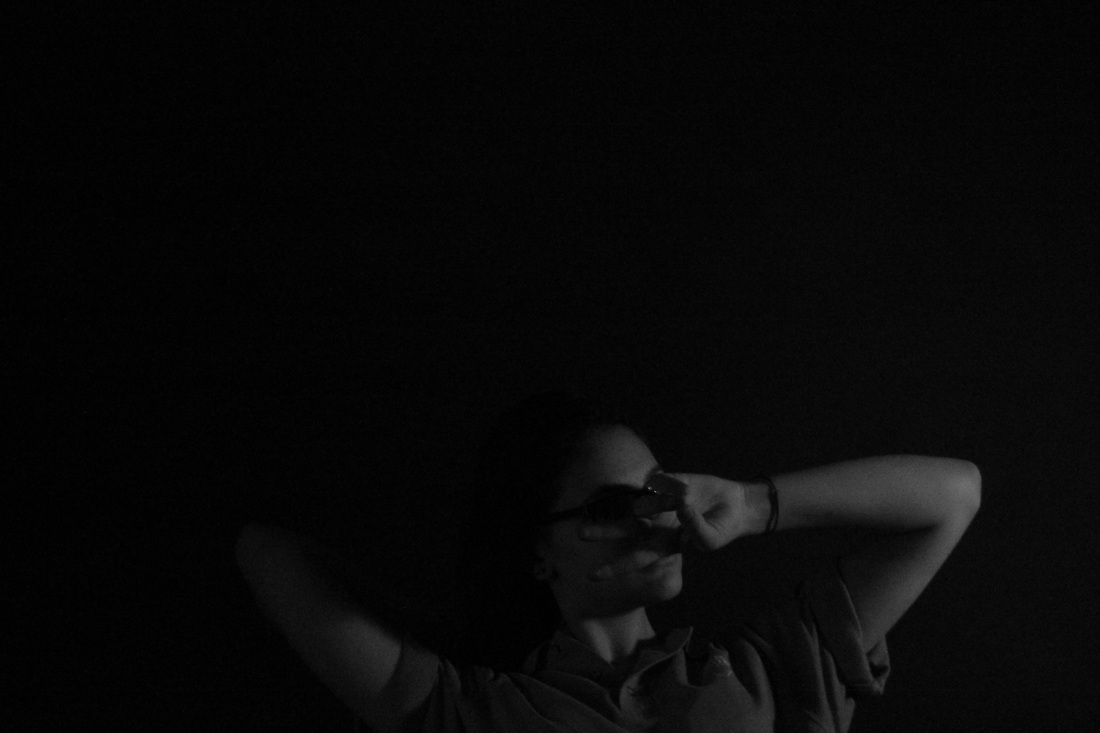
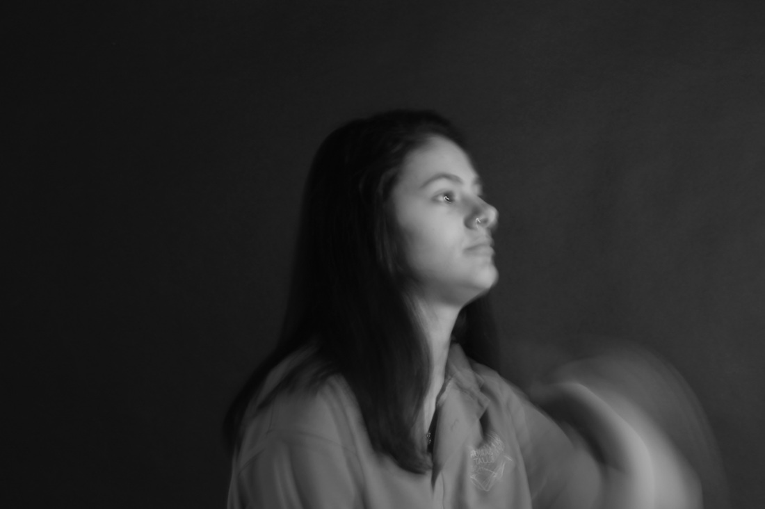
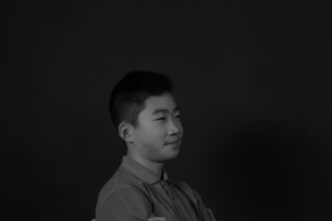
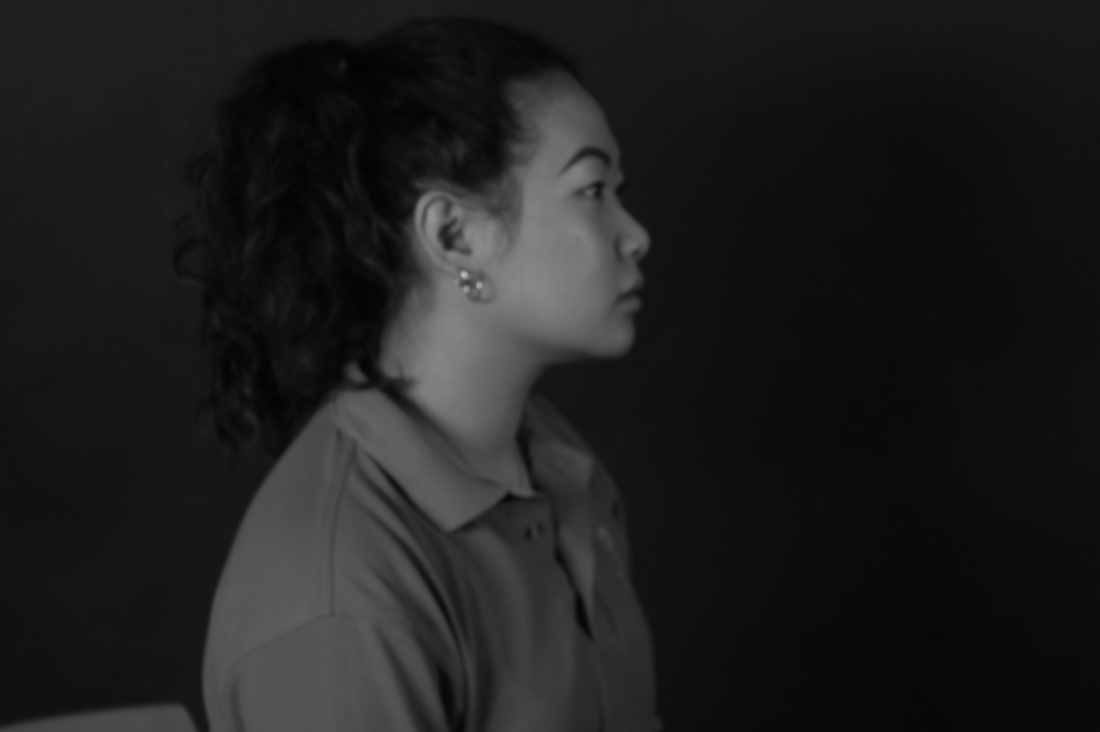
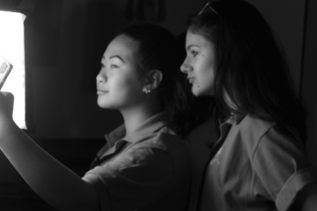
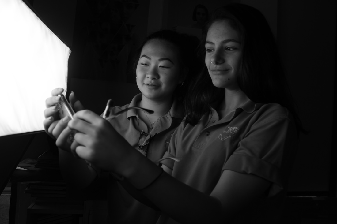
Evaluation
For this set of image, it started off not as well because as you can see the images were really dark however as we was getting better at it as we was taking more images, we tried turning the aperture up but it was too bright so we turned it down. I really like this type of experiment because it was a lot of fun to learn how to control contrast with a slr digital camera. The first few images didn't work out well because its too dark and image 12 is too bright however after that the images are really especially 16 and 17.
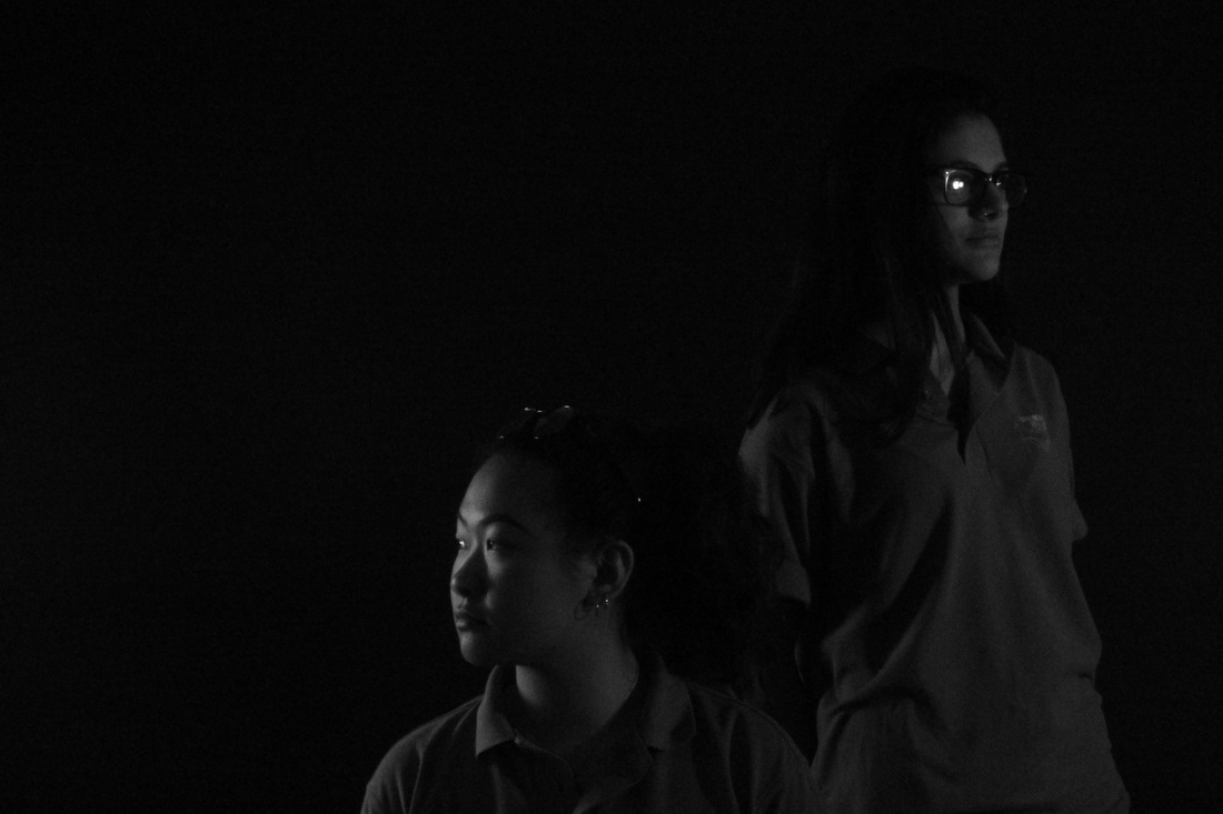
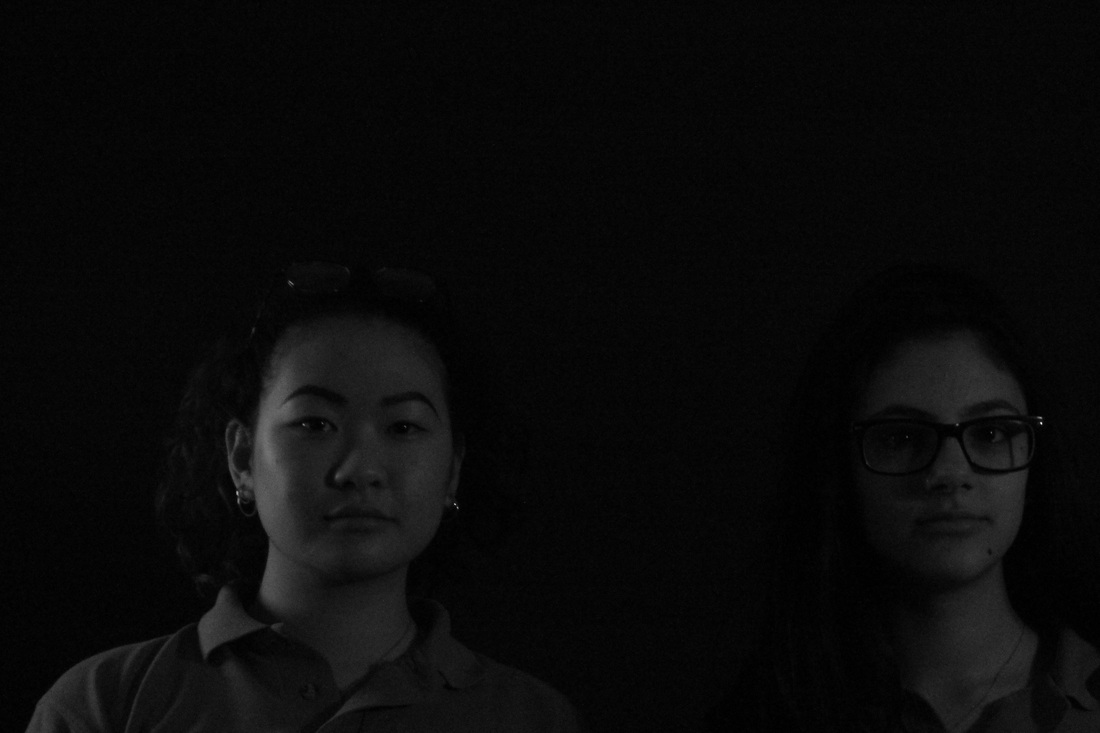
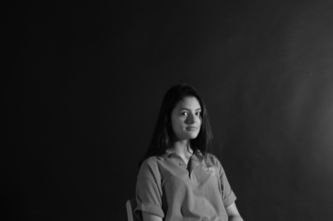
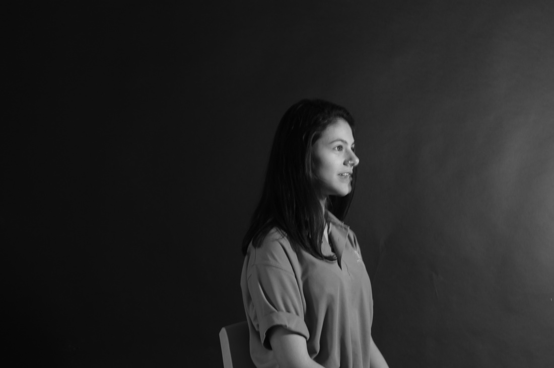
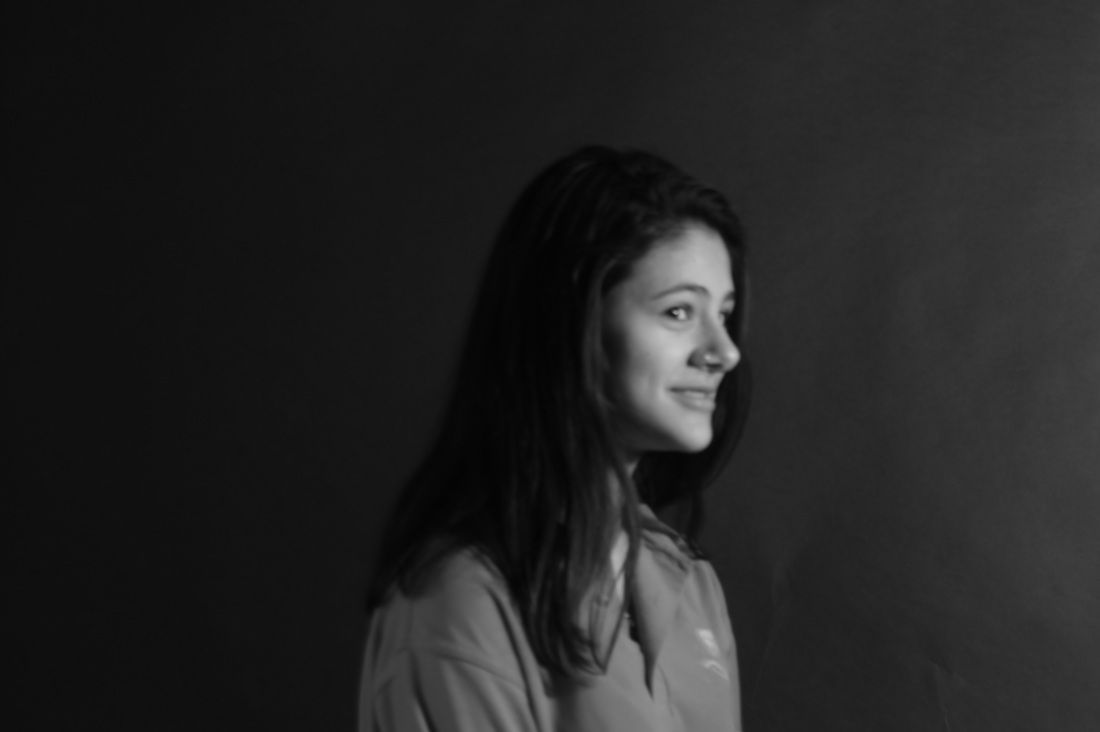
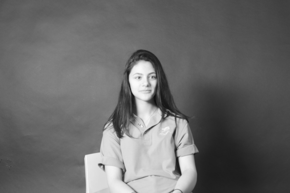
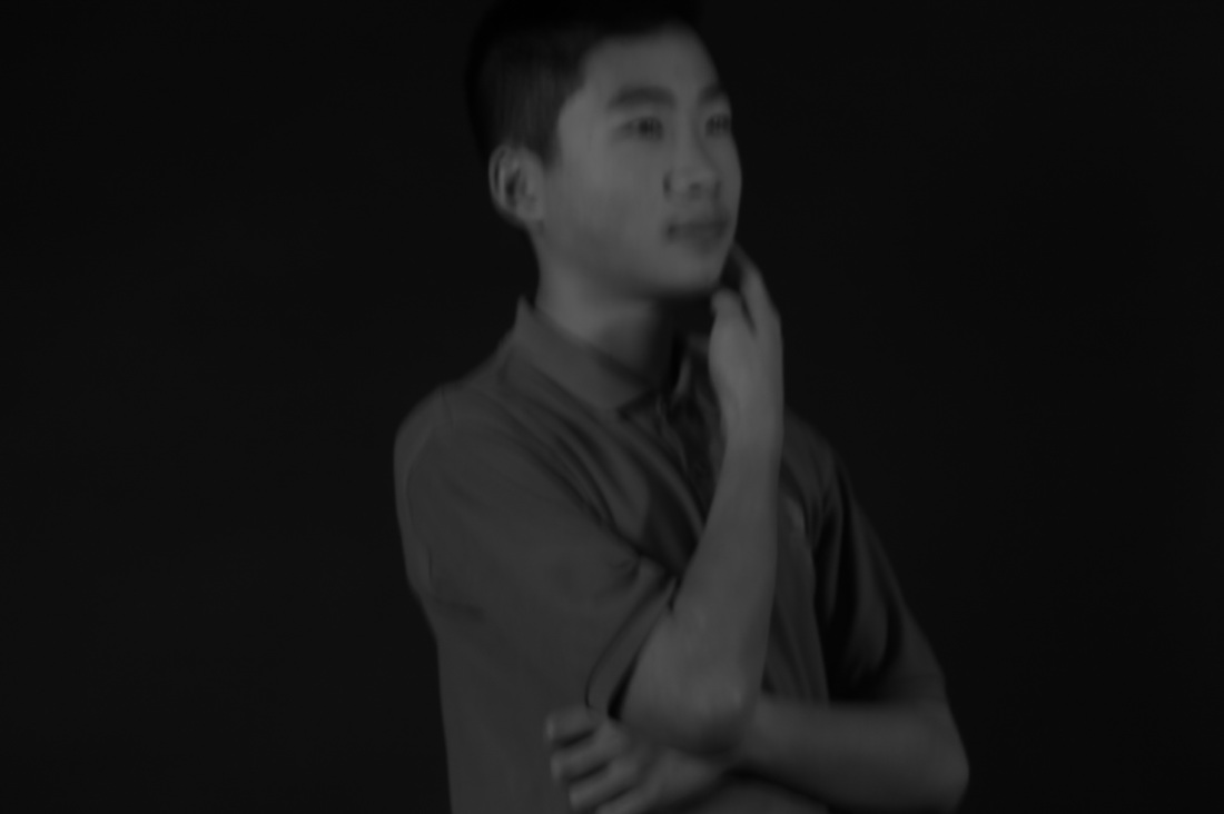
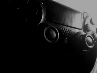
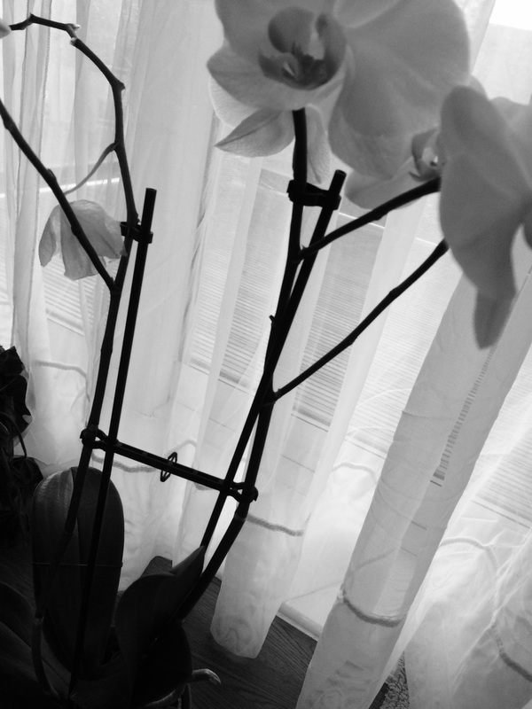
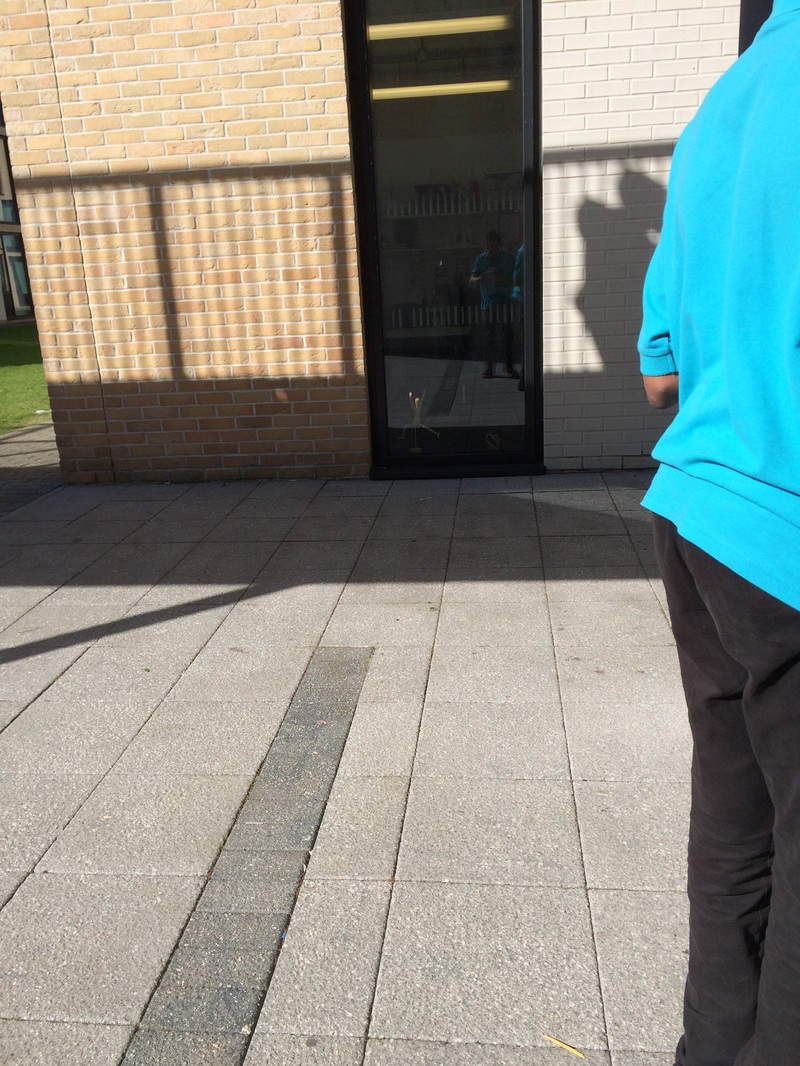
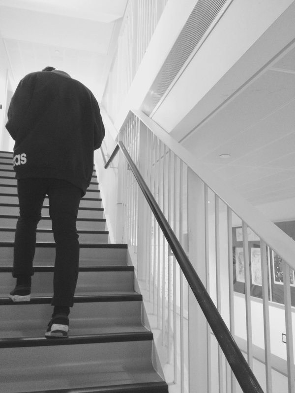
My example of light and dark. |
Evaluation |
|
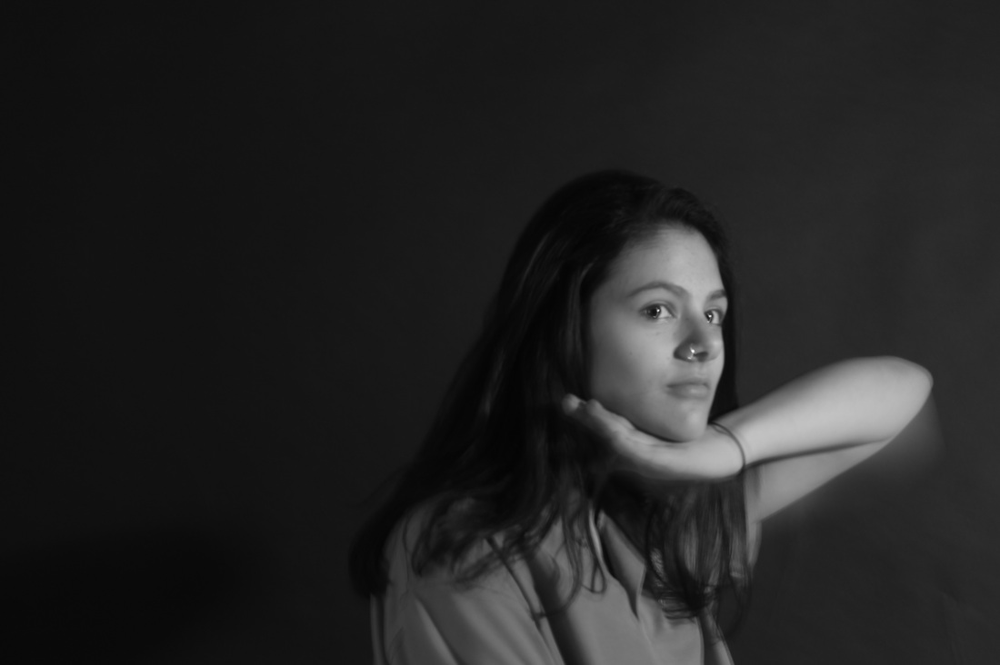
This image was inspired by the first set of images i took but i changed a person into a object. I like this image because the tone is balanced out. The contrast is also balanced out by the white and black. The main focus of this image this controller. The gradient of this image really smooth because black and white just merges together. The light is coming from the top right corner.
|
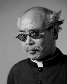
Trent Parke
|
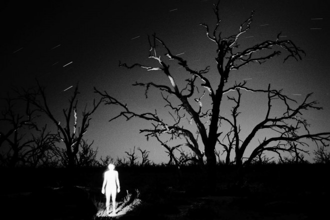
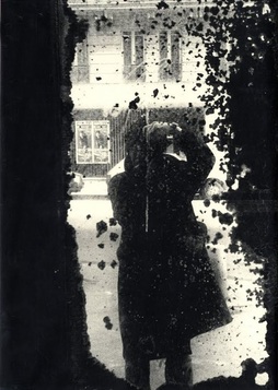
I think Trent Parke is making the main focus in this image is the white figure, this is mainly because most the light is shining on that figure also making the background seem even darker. The light shining on the figure is so dark you cant actually see the persons face or what they're wearing. This picture almost looks like something out of a horror or si-fi movie. The darkness appears to be the most dominant than light which actually gives the image a horror theme. I also think this image was taken at sunset because it looks like theres a little bit of light coming from the distance. |
|
Elliott Erwitt
|
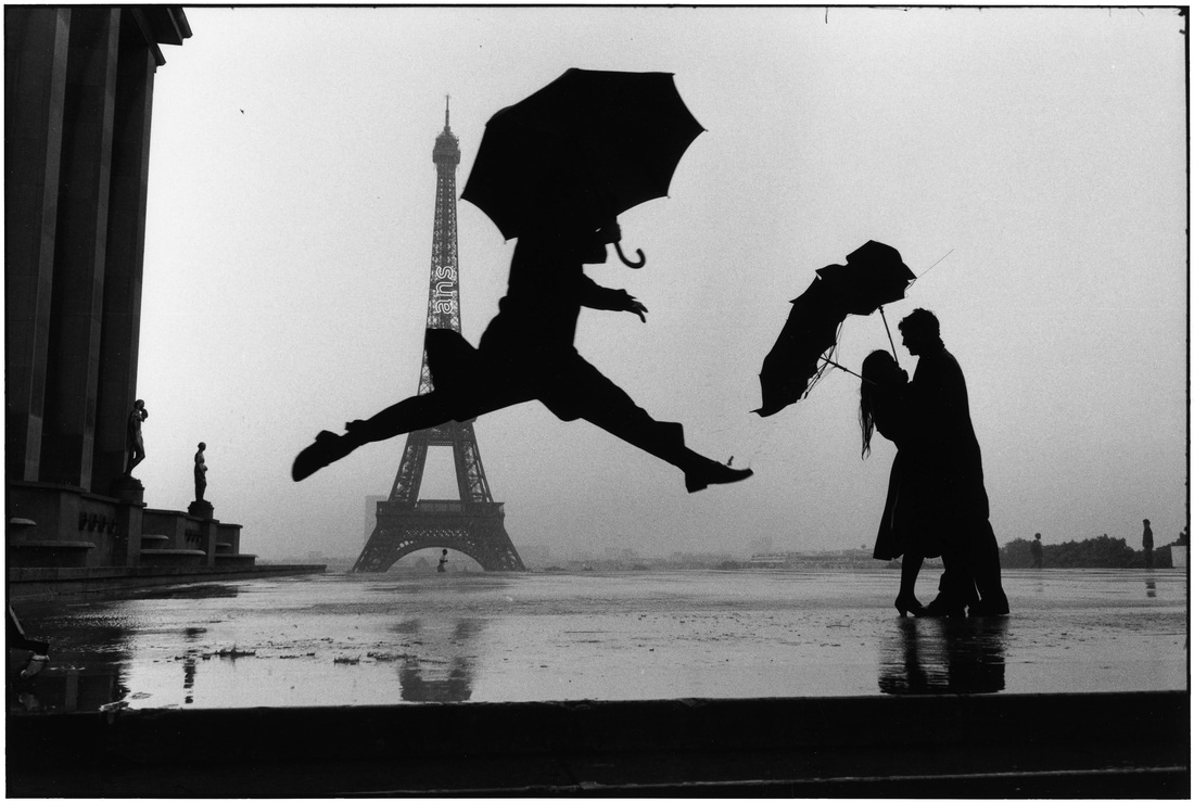
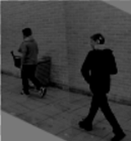
I think Elliot Erwitt focuses on nature light as you can see this image. I like this image because it focuses on the person jumping and the the couple on the back. This makes the image interesting because its makes the viewer ask questions. For example; why is he jumping? , what is the couple at the back doing? The depth of field is deep because as you can see the the background is focused on the eiffel tower and the foreground is focused on the person jumping. You cant really tell where the light is coming from.
|
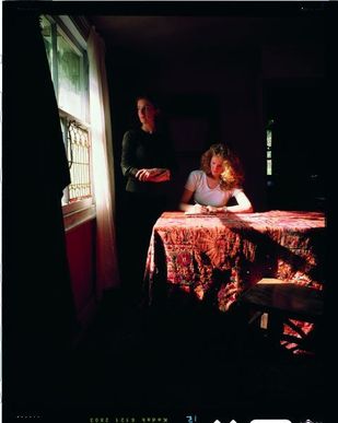
Tom Hunter
|
This image is taken by Tom Hunter. This image is to me is about a woman who is writing a letter or something to someone and the woman who is standing up is the servant who is waiting for the her to finish the letter so she can post it. The light is a harsh because its focusing on the table and the faces of the 2 women. This makes me want to ask; what is she writing? why is she staring out the window? and what is she looking at? The image is composed like the women sitting down is the boss of the women standing up.
|
|
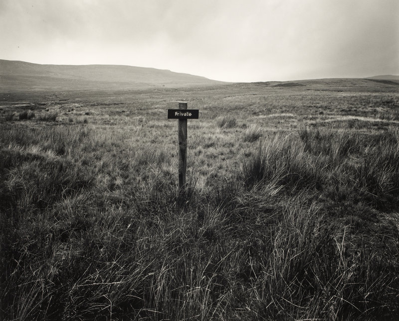
Fay Godwin
|
I think this image by Fay Godwin is interesting however its dull at the same time because this images doesn't have a lot going in the background and this also makes me ask a lot of question, like why is this place private? where is this? I think the light is soft light because the light is shining everywhere. The depth of field is very deep because the background is the hill and the foreground is the sign that says private.
|
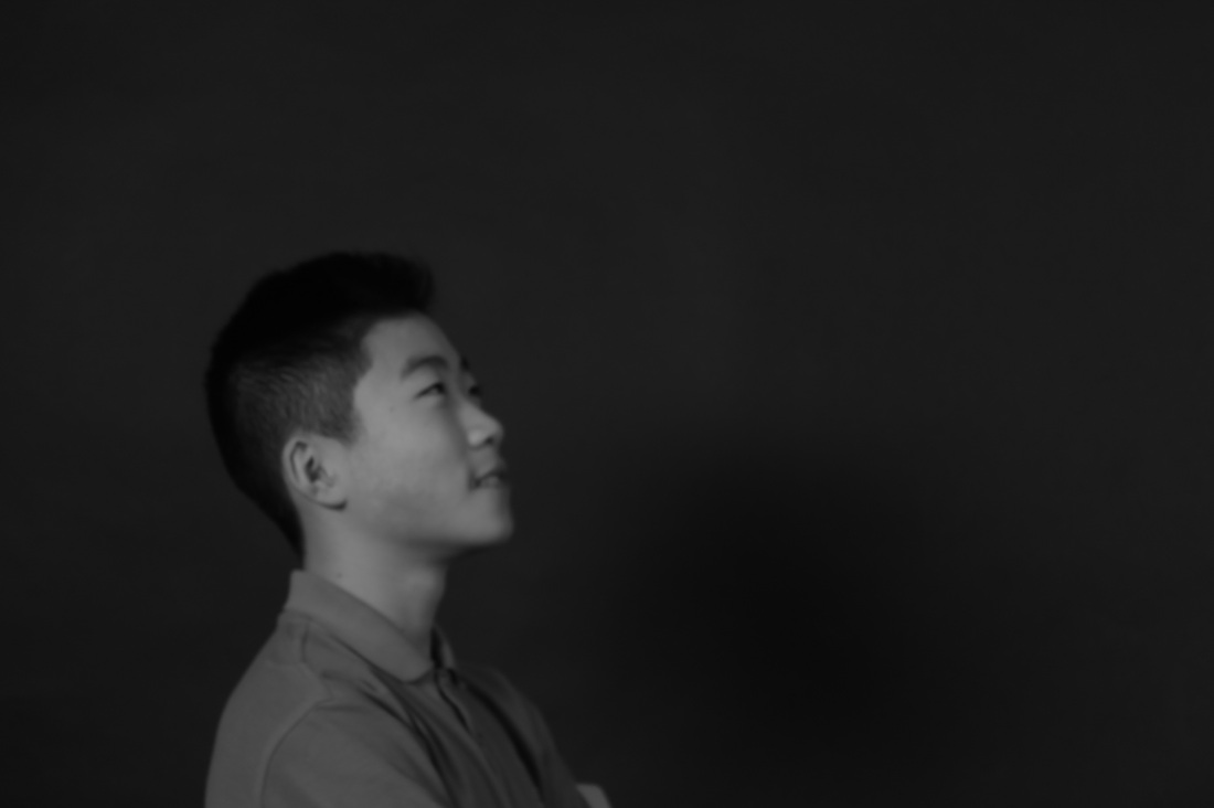
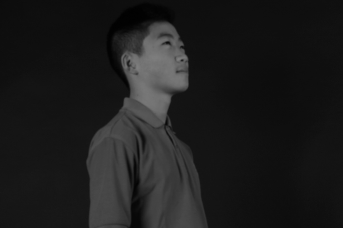
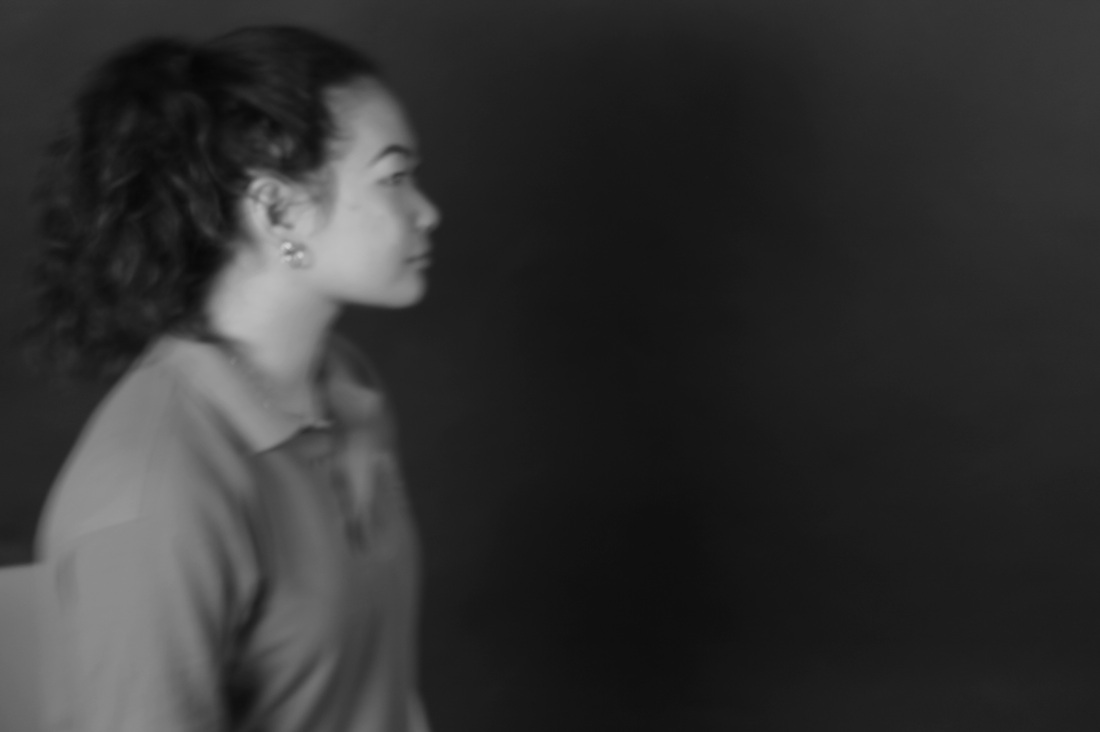
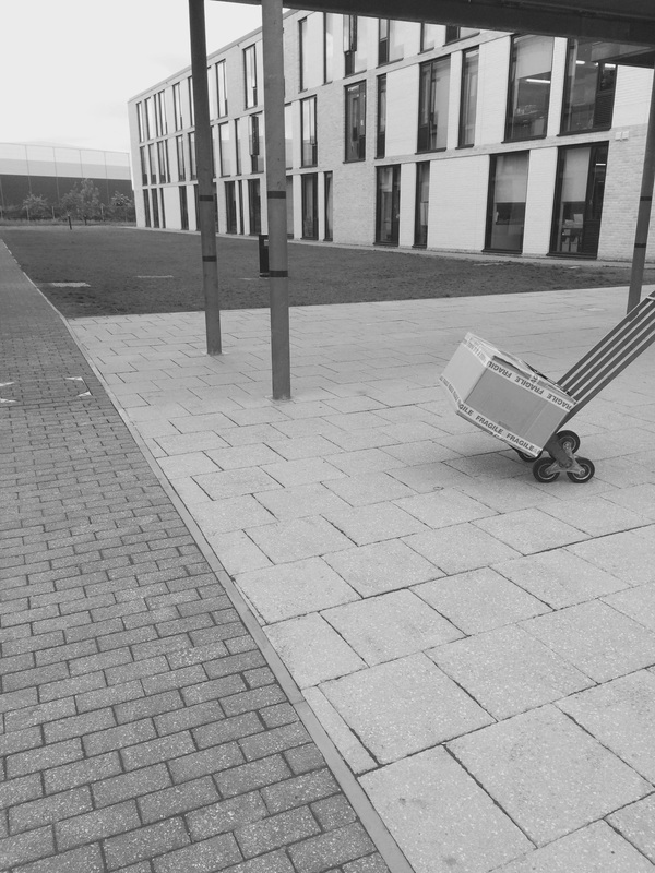
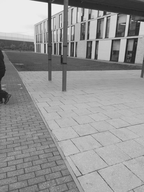
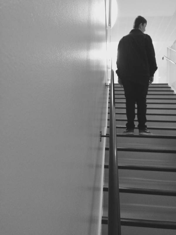
Contrast #2
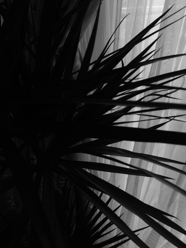
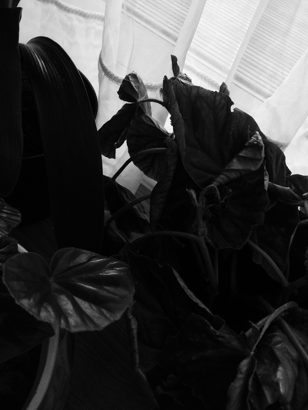
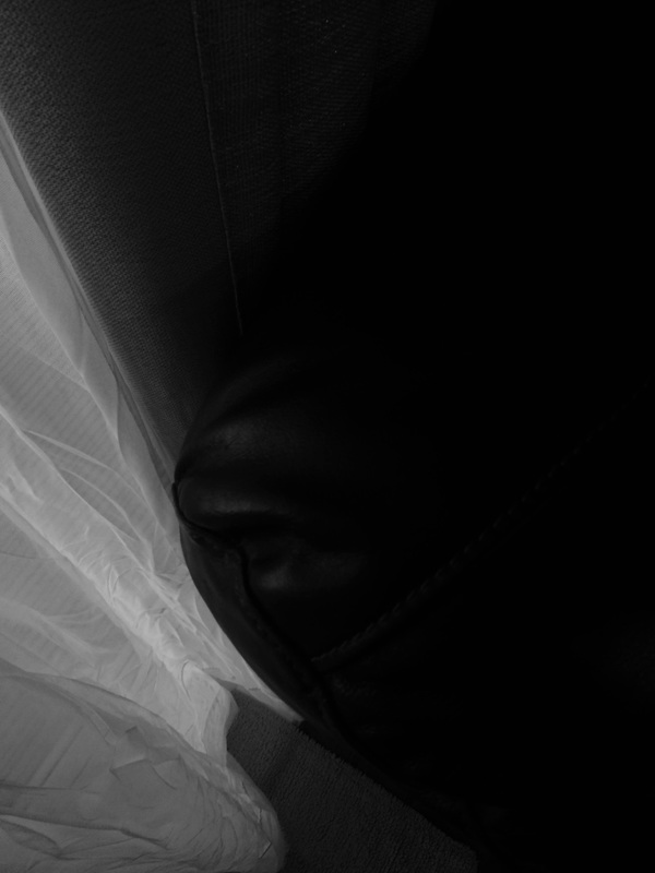
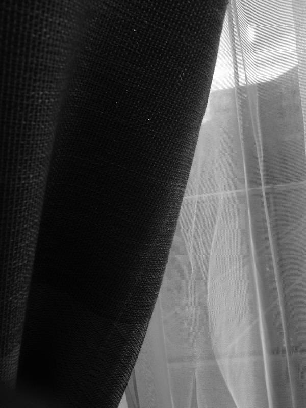
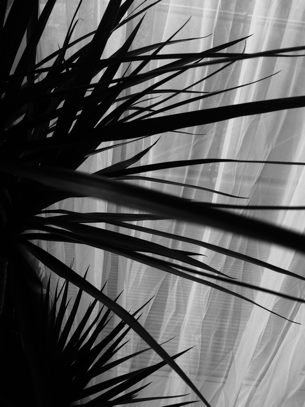
The theme of this set of images is contrast as i'm taking the image in black and white, also i was trying to focus on shadows and contrast on these images. I think these images are really dull because i think theres no meaning to these images. I like these image because they look really nice because of how the black and white blends in together. The depth of field is narrow.
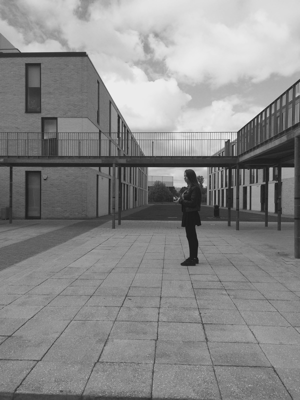
Contrast #3
In this set of images, I was trying to focus on the 4 corners however I struggled with it, I could of done better with this set of image by trying to arrange objects before taking the image. I don't like any of these images because I think than is no meaning to than however the 8th image is one of my favourite images of this project because the arrangement of this image make it look good and it focuses the background instead of the foreground, it make it so much more interesting and it makes viewers ask questions.
Diado Moriyama.
|
Born in Ikeda, Osaka, Daidō Moriyama studied photography under Takeji Iwamiya before moving to Tokyo in 1961 to work as an assistant to Eikoh Hosoe. He produced a collection of photographs, His Nippon gekijō shashinchō, which showed the darker sides of urban life and the less-seen parts of cities. In them, he attempted to show how life in certain areas was being left behind the other industrialised parts.
|
Experiment #1
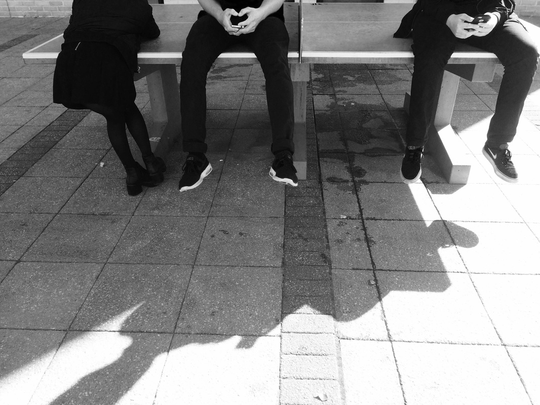
Evaluation
This set of images are splits images. I tried to take 2 images and putting them together to make them look like one image and i think that has worked out so far. The way i composed the images make the images look like 1 image. I really like the one where 3 people were sitting on the ping pong table because it close to being realistic. I also like the one where the people are sitting on the floor because the contrast of the images.
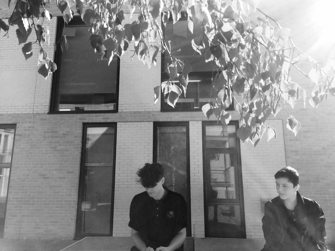
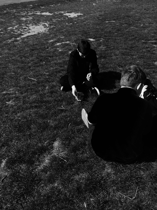
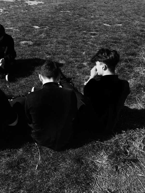
Experiment#2
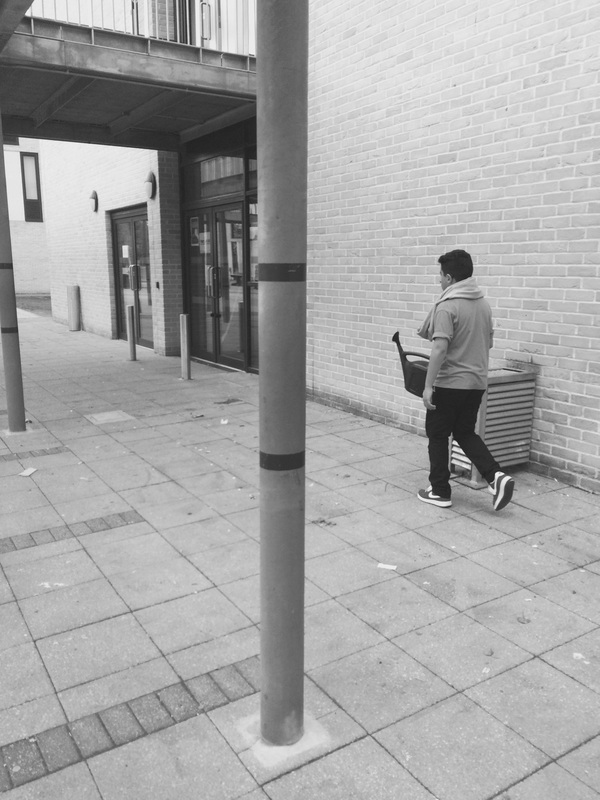
Evaluation
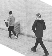
I really like this set of images also i think this set of images are better than my first set of images because it looks more realistic than the other set of images this is because i have experience of doing this because i have already done it once. I have composed it really well however i think i can do better by making the background and foreground look the same in both images. I like the images of the 2 boys walking to the green block because it looks better than the other images in my opinion because it looks the most realistic out of all of them.
Araki Nobuyoshi
|
Araki Nobuyoshi is born in Japan, Tokyo. He is a photography and a contemporary artist. Most of him images are nude of women either tied up or laying down. I think thats creepy because it looks like the woman is getting abused. Like the way how his tires the women's up and they are naked makes it really creepy.
|
Final Piece
|
This is my final piece, this image is make of 2 images on photoshop. The 2 images is used from the my 2nd experiment, i think this is my best image because its looks so real. This image make the audience ask if the image is a image or 2 images. The positioning of the image is placed into a boy following into the other. The tone of this image is really dull as it is in black and white.
|
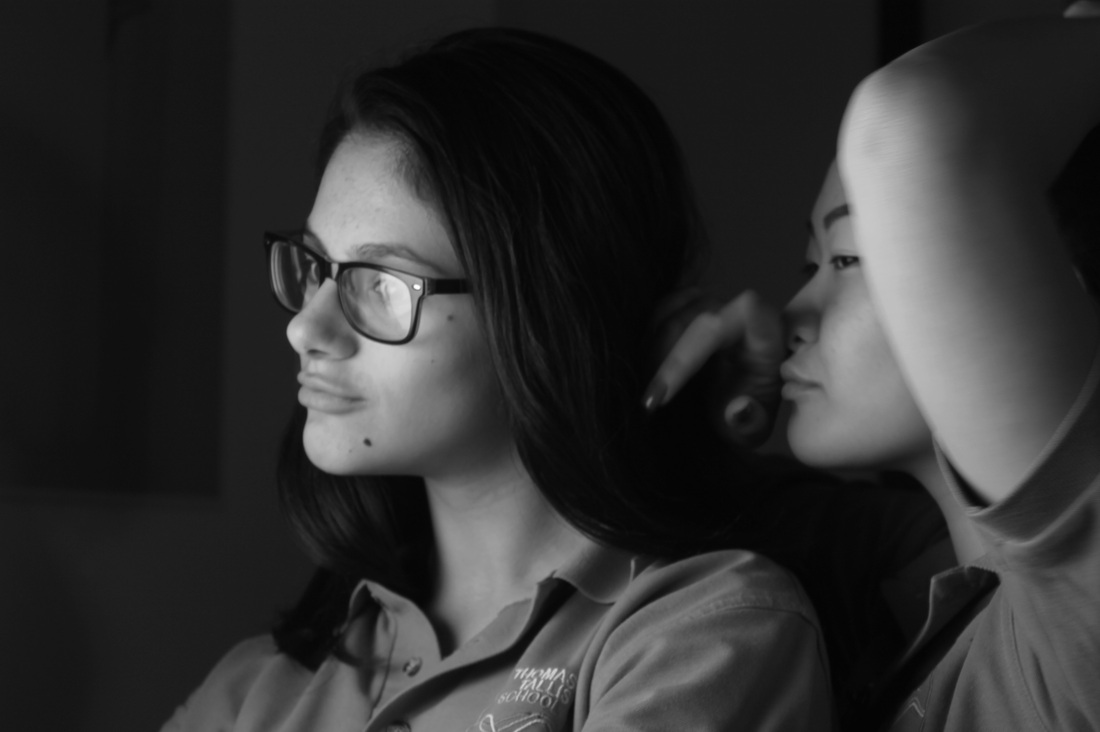
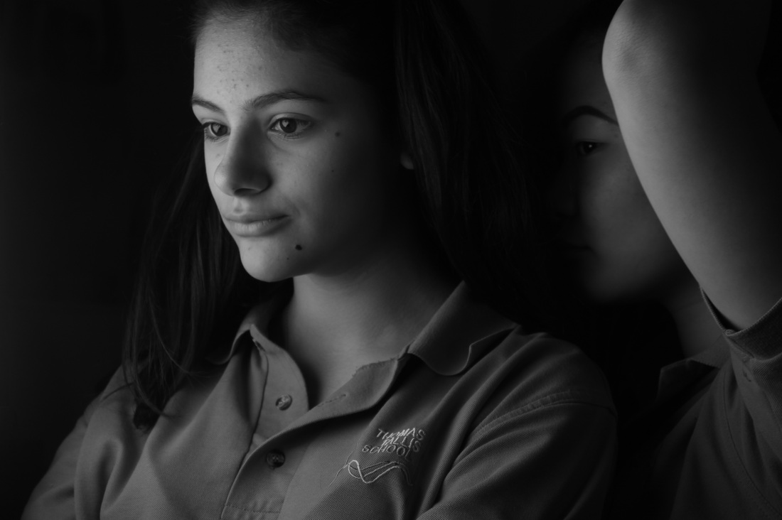
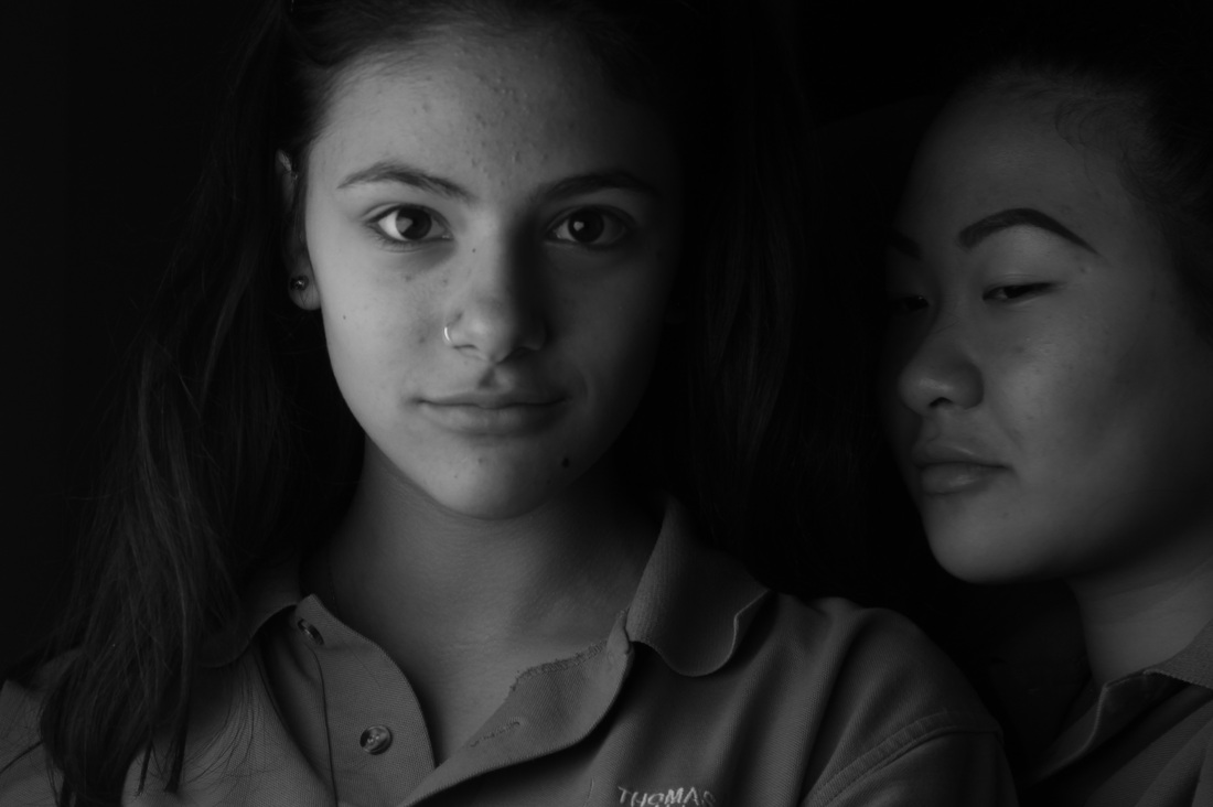
Experiment #3
I think these 6 images are one of my best experiment because 4 of the images looks the like they are 1 image for example photo 1 and 2 they look like they are one image. The composition of these images are POV(point of view) because i think these images are long images because of how they are positioned. I think the tone of these image are pretty normal, theres sunlight but theres also shadows so that balances the tone out.
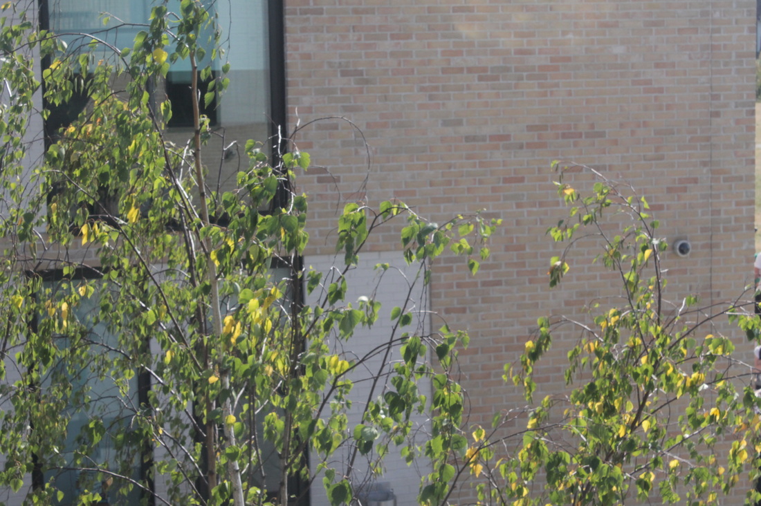
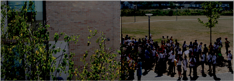
Developed Image
|
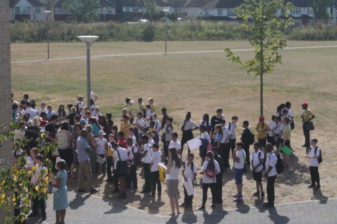
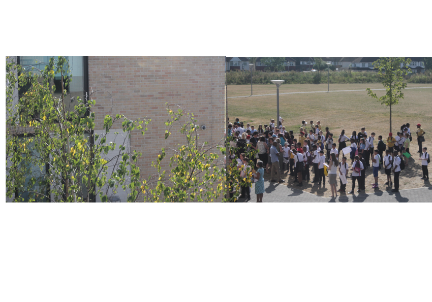
I developed this image on Photoshop and i think it looks really good because i accomplished what i wanted, which was taking split images when i start taking these type of image. Also the composition is, i think the students at the bottom is at the back and the tree is the foreground. The contrast is high because the sunlight is exposing the everything. The depth of field is very deep because the background and the foreground is far apart. The tone of the image is bright and theres a lot light.
|
Experiment #4
Evaluation
I think this is the best experiment i have done for this project because the images are really good, the 3rd and 4th images looks like one image. However i think i can develop them and make them look more realistic. The tone of these images are not as bright but its also not as dark, its in middle of being bright and dark. The gradient is merged together but the second image is much more lighter than the first image but i can develop that on photoshop to make the image darker in terms of contrast. For my next step i want to experiment on taking images of people like my first experiment on this project or experiment on photoshop.
Final Piece #1
|
|
Evaluation
This is my first final piece. I was focusing on splits images and the contrast of it. I took 2 images and developed them on photoshop by putting it together. I think these images are really good because the images look really realistic. At first i find doing these images really hard because the position is weird because Im taking 2 images and trying to make the images look like its one image. However as i experiment more it was getting easier and easier. The images are mainly focused on, well i cant really tell what the images are focused on because all the images are different. I really like these photos because the effect of the images are really good and i think the images are really realistic.
WWW: I think the images are really realistic is which what i wanted, also the contrast images are blends in well together. The light quality of these images are really good because its not too bright or not too dark.
EBI: I could do better if i experiment more by taking more photos or editing more on photoshop. I could also improve my work if i edited more of my images. Also i could also consider the texture of these images and the what to place in the images.
