|
Abstraction
Abstraction is the process of taking away or removing characteristic from something in order to reduce it to a set of essential characteristics. In object-oriented programming, abstraction is one of three central principles (along with encapsulation and inheritance). 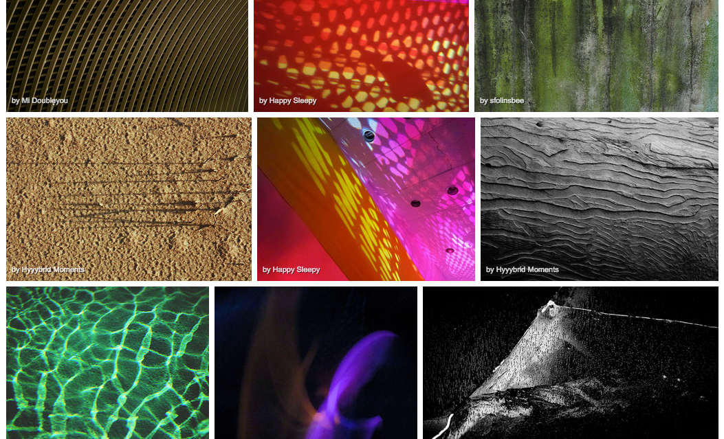
|
|
Paul McGuire
|
Paul Mcguire has been working in developing computer software since 1980's while dabbling in computer generated art as his hobby. One particular artistic algorithm he has returned to again and again is the fractal mesh, a process that takes an ordinary triangle, and repeatedly applies a random warp or deformation, breaking it into smaller triangles. Each successive generation further deforms the sub-triangles, and an overall 3-dimensional effect emerges.
|
|
Nick Grove
|
Nick Grove combines traditional painting skills and techniques with modern digital technology to create these wonderfully rich and glossy abstract images. Initially working with oil paint, Nick drips, pours, brushes and even throws his the paint on to the canvas. Each layer is specifically mixed to the correct colour and consistency to create a unique visual concoction of abstract form and mark. Using his instincts Nick then peels, scrapes and scratches until he unearths a satisfying whole image. He then manipulates this image on the computer using the latest digital software until he finally realises the finished abstract work.
|
NG-13
|
Abstraction Photo Shoot no.1
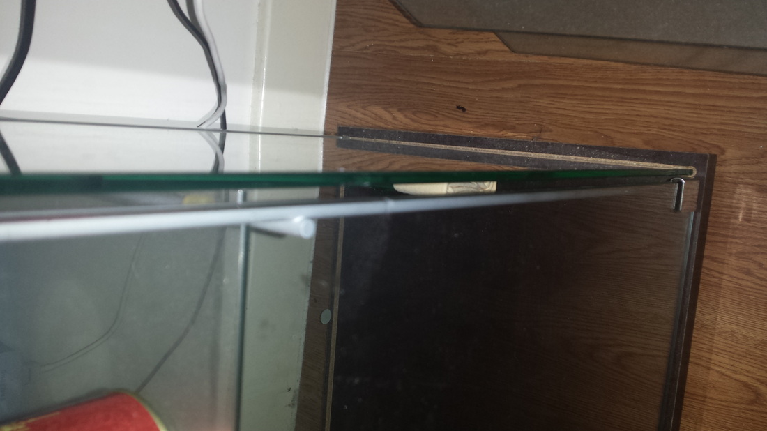
EvaluationThis is my first photo shoot for abstraction, at first i didn't no what i had to take picture of. So i started to take random images of the images on the wall in the school buildings. Then i took images of the plants and the post. Next time i think i should take images on line and texture because i think that will make my images a lot better.
|
|


Abstraction Photo Shoot no.2 |
Evaluation |
|
|
I was walking home when I took these images. I think I have done well for this photo shot because i have focused on lines and some of it is texture. I don't really like this set of image because it seems boring not a lot is going on in the images.
|


Lines


Lines and Light Images.
|
|
These images are ones which I have taken of my theme where I focused on three of the formal elements which are line, texture and light. I have practised really looking at the lines which I saw around which encouraged me to look at the objects from different angles. I think i have done well on taking the this set of images because i have focus on the technique i have choosing. The composition of this set of images is sort of placed in all sort of different places. The tone of this is all light expect number 2 because it was focused on the sun. The depth of field is, i would say its long because the way how its structured. The contrast of this set of images is some of them light and some of them dark for example image 2 is pretty dark.
|


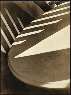
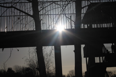
Focus: The whole subject is in focus. However, there is a slight softening of the focus towards the bottom of what appears to be the edge of a table top.
Light: A triangular slash of bright sunlight appears in the middle of the image. This is accompanied by bands of light running diagonally across the upper portion of the image. These appear to be gaps in another object out of shot, a fence perhaps.
Line & Shape: There are number of strong lines, mostly straight, although these are complemented by the sweeping curve of the main object which runs from the top right of the image to the bottom right. All of the lines have the geometric quality of man made objects.
Repetition: The shafts of sunlight running across two surfaces create a dramatic rhythm. A number if straight parallel lines are repeated in the composition, like repeated notes or beats in a piece of music.
Space: The space in the image appears quite shallow, tightly constrained by the cropping. We don't the whole of any of the objects and the photographer appears to have been quite close to the subject.
Texture: All of the objects in the image appear smooth. The drama comes from the jagged bursts of light across their surfaces.
Value/Tone: The image contains a range of tones from very dark to very light. There are deep shadows but also mid tones. The photograph is monochrome but has a brownish tint, perhaps caused by the paper the artist has used.
|
|
These images are mainly focused on the things in my house and the formal elements are lines and light. Im personally happy with these images however i feel like i could taken better images if i went outside. Next time i would like to focus more on lines and light on nature. The composition of these images are all placed on in the same place i think because the way how i have taken the image. The tone is all light because the flash was on. I took these images on my phone, I didn't use any app. The depth of field is quite shallow because some of them you can't really see the background. I have decided to focus on line and light.
|


Evaluation:
This set images are focused on light and line. I have focused on taking images of furniture because they is a lot of lines in furnitures and also i used the flash on my phone to get the lighting in the images. I think these images are ok because i have focus on the formal elements i have chosen. The composition of these images are either close up or look down or up. The tone of these images are light and dark at the same time, its light because the things that i focused on are light and the things that isn't focused on is dark. The depth of field for some of the images are shallow because you can't see the background as for the others its deep.
Francesca Woodman
Francesca Woodman was born in 3rd April 1958 and studied at Rhode Island School of design. She was only 23 when she committed suicide. Her work of body was remarkable as people would say. Her body of work would garner increasing renown in the world of contemporary art since her suicide. She was brought up to an artistic family in Denver. She moved to New York in 1979 and began her career as a photographer. Her work would remain unknown for all of her life but today its widely celebrated for her black and white depictions of young women, frequently in nude and its blurred by the slow shutter speed and long exposure.
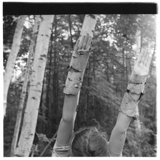
This is image is taken by Francesca Woodman, I think its a really image because the way she has constructed it. I think this image is about disguise because the girl putting her hand up is trying to blending with the trees, as you can see her is wearing the tree lodges. The contrast is black and white, this makes the viewer want to ask question for example; why is it in black and white and why is trying to blend in with the trees. I can't tell what the tone is, i think its light. The depth of field is far because the background is really far away from the foreground.
Paul Strand
|
Paul Strand (October 16, 1890 – March 31, 1976) was an American photographer and filmmaker who helped establish photography as an art form in the 20th century along with the modernist photographers like Alfred Stieglitz and Edward Weston. His diverse body of work, spanning six decades, covers numerous genres and subjects throughout the Americas, Europe, and Africa.
|
|
Abstraction Development and planning
Lines/Focus |
Focus |
Light |


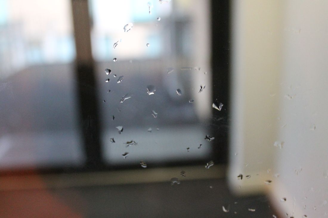
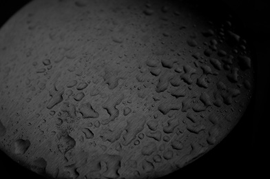
My next would be to research on artist that do similar things to me. For example I will research on Peter Keetman and focus on some of his work. Peter Keetman studied photography in munich from 1935 to 1937, in 1948 he passed the examination for the Master Craftsman's Diploma. 1949 co-founder of FotoForm (together with Otto Steinert, Toni Schneiders a.o.), a group with great impact on the new photography in the 50s and 60s in Germany and abroad. Some of his work are really interesting, for example;
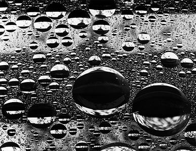
This image is really interesting because the water that is in the window makes you want to see what's in the back ground. One of my question for this image is what it look like if the image is in colour and why was this image taken like this? I would want to do something like this but in my way.
What to do next
I think i should still focus on lines however i would like to focus on water/nature in my images. I want to do this because Peter Keetman's image with the water dropping down inspired me to do something like that. I would also like to develop my images by taking a set of images and choosing the best ones and then take another of images based on the best one from set 1.
2015/01/28
Evaluation |
|


This is my first set and the right hand side is my developed set. I think i did well because they are well composed and i focused on lines and water. I think that the developed set looks better because it has more contrast to them and it have more tone as well. I could do better by going out to take images outside of school and i could focus more on lines because when i was taking these images i was just taking images of water at first.
Final Pieces.
|
|

|
Evaluation
I have chose these 3 images as my final piece because they all have the formals elements i have chosen which is Line and Light. The first image is really good because you can see how its composed and i have focused on water which is inspired by Peter Keetman. I feel like this image is really good because the tone is at the right point and the contrast makes the image have a darker tone to it so it. the depth of field is narrow because the foreground and background are quite close together and the composition is the water placed on the pole.
Final Experiment


Final Piece 2.


Final Evaluation.
This is my abstraction final evaluation. I think I done well. For my first artist research I research an artist called Paul McGuire, he works on artistic algorithm and developing computer software since the 1980's. I like he's work because its different to the other artist i have looked at. However i didn't do any experiment because he does work abstraction work on art. Then I research on Nick Groves who does combines traditional art and modern day technology to create abstract work. I don't mind his work however I don't like his work at the same because I found them boring because I don't understand what the printing are. For my first experiment I went around the school and take images of random objects because i didn't under how to take images of abstraction. For my evaluation I said: " This is my first photo shoot for abstraction, at first i didn't no what i had to take picture of. So i started to take random images of the images on the wall in the school buildings. Then i took images of the plants and the post. Next time i think i should take images on line and texture because i think that will make my images a lot better. " For my second experiment I was walking home and I started taking images of the streets. I didn't like these images as well I chose the ones I think are good and developed them on iPhoto on a Mac. I was happy for my work after the development because it's was so much better after the development. These are the images:


This is my abstraction final evaluation. I think I done well. For my first artist research I research an artist called Paul McGuire, he works on artistic algorithm and developing computer software since the 1980's. I like he's work because its different to the other artist i have looked at. However i didn't do any experiment because he does work abstraction work on art. Then I research on Nick Groves who does combines traditional art and modern day technology to create abstract work. I don't mind his work however I don't like his work at the same because I found them boring because I don't understand what the printing are. For my first experiment I went around the school and take images of random objects because i didn't under how to take images of abstraction. For my evaluation I said: " This is my first photo shoot for abstraction, at first i didn't no what i had to take picture of. So i started to take random images of the images on the wall in the school buildings. Then i took images of the plants and the post. Next time i think i should take images on line and texture because i think that will make my images a lot better. " For my second experiment I was walking home and I started taking images of the streets. I didn't like these images as well I chose the ones I think are good and developed them on iPhoto on a Mac. I was happy for my work after the development because it's was so much better after the development. These are the images:


I decided to pick these from some of my experiments because they are some of the best images in this project. I think these images are the best be they have all the formal elements that I'm focusing on and the way every thing is placed makes it better. This is my second final piece:


